Globaledit was born 20 years ago when the industry shifted from film to digital. Steve and the founding team built a groundbreaking platform that allowed users to access, compare, markup, and transfer thousands of assets directly from the set. This technology revolutionized the workflow for creative teams.
Over the past two decades, both the industry and Globaledit have evolved immensely. As we stepped into 2024, we thought it was a great time to refresh our brand—to realign our design and identity with the modern evolution of our platform and the creative community we work with daily.
Teaming up with the amazing minds at Studio Ljudje, we created a contemporary brand that looks, speaks, and acts like a creative.
Last week, we proudly unveiled Globaledit’s new look and feel at our user conference. The new identity integrates different elements—new colors and gradients, modular systems, and a distinctive line with a bold personality—each contributing to express the power of our platform while capturing the energy and spirit of the teams who use our product every day.

contemporary colors
One of the most significant changes is our new core brand color, a dynamic orange hue we call Creative Orange. Complementing the bold nature of Creative Orange, we added Organized Violet, Contemporary Pink, and Reliable Ocher. These colors come together to create a modern and recognizable palette.
Pushing this even further, Studio Ljudje developed accompanying gradients for each color to depict play, movement, and emotion within our tech-focused world.
timeless typography
At the heart of many design teams is a typography enthusiast. We’ve elevated Globaledit’s typography with a timeless sans-serif font that embodies a clean, contemporary aesthetic. We also gave our logo a subtle update with this new typography, maintaining our iconic symbol.

graphic elements
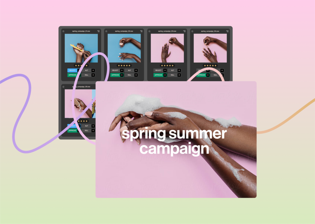
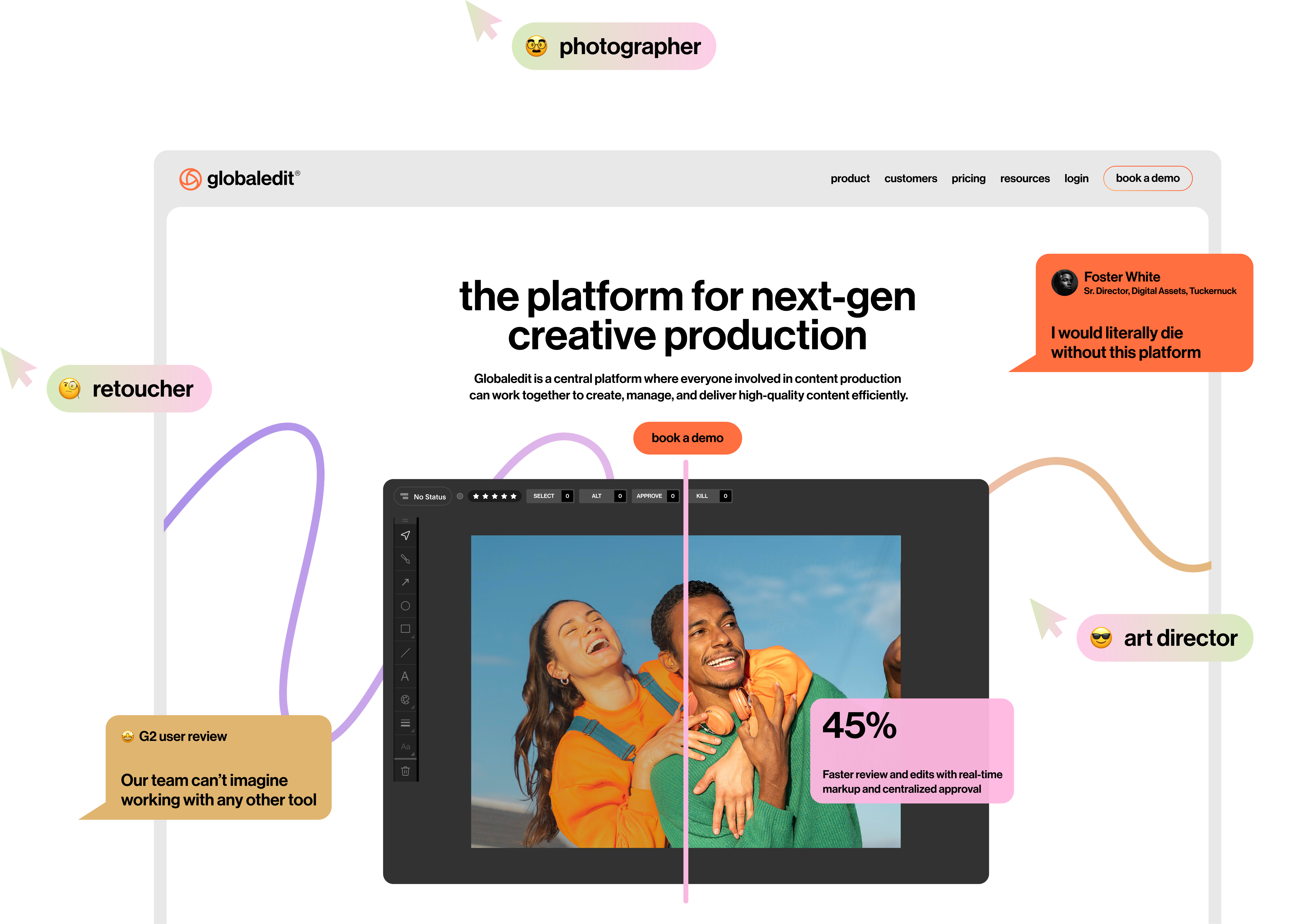
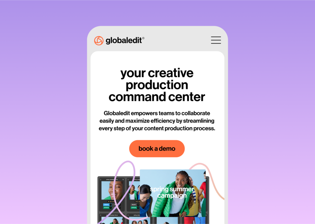
Our new colorful graphic elements draw inspiration from the Globaledit interface and functionalities such as markups, comments, and tags. These are creatively illustrated to establish a unique visual language that enhances understanding of our product. From chat bubbles between an art director and a retoucher to tags highlighting new AI features, these graphics are instrumental in articulating key features of our product.
a creative line
The scribbled lines, inspired by the markup drawing function, represent the creative process with its ups and downs, ins and outs. The line also brings a human touch to the tech product, bridging the gap between technology and creativity.
modular system
Our new design system features a modular grid, providing a structured framework for diverse design applications. Whether it’s social media posts, website layouts, or email campaigns, this system brings clarity and organization to every touchpoint.
Our reimagined brand identity not only revitalizes the look of Globaledit but also encapsulates our dedication to innovation and commitment to our users. It’s a reflection of where we are today and our vision for the future, designed to resonate with and inspire the creative communities we serve.
Moving forward, our site will remain a great resource for product announcements, customer stories, whitepapers, and more. Keep an eye out for more to come!